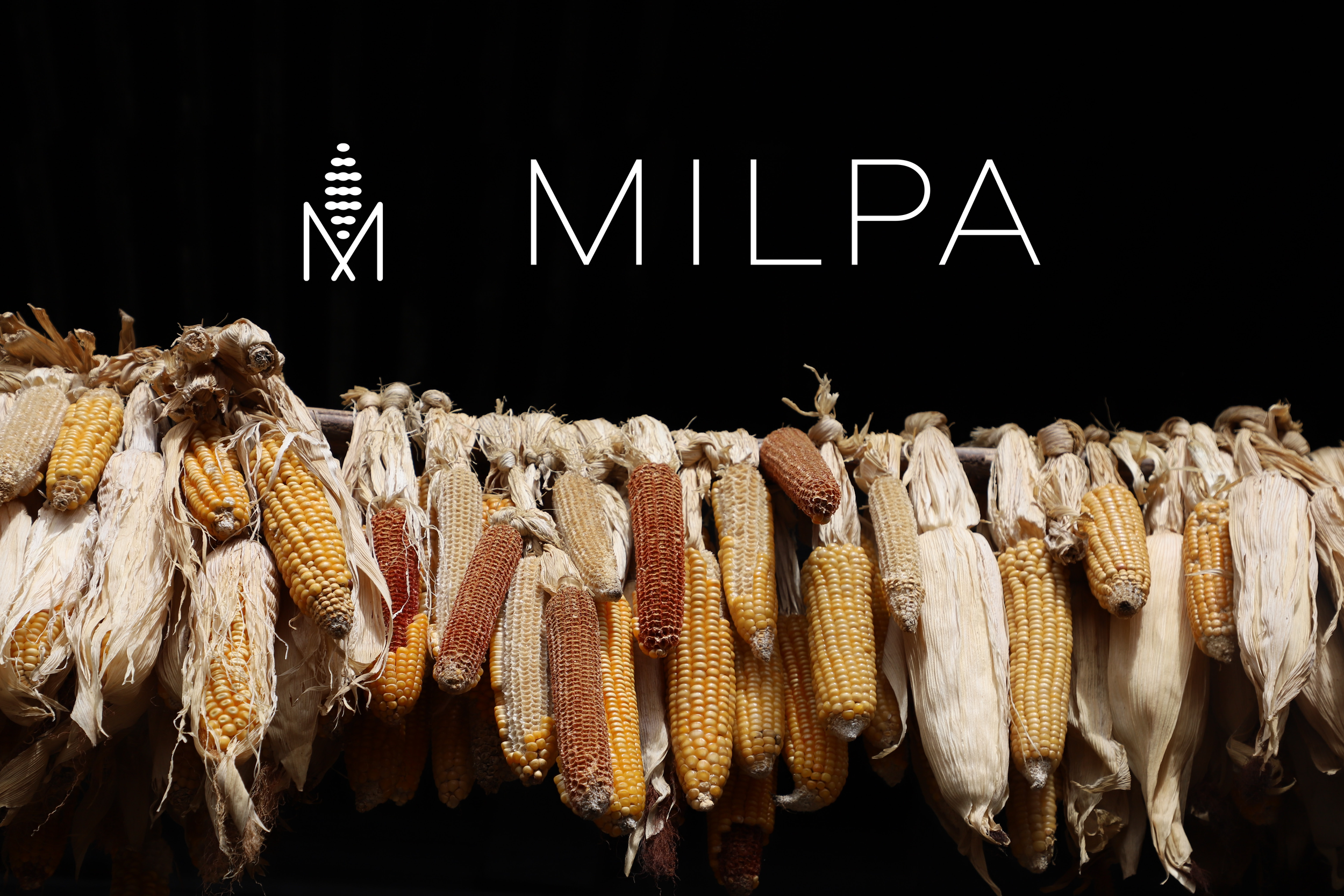
MILPA
Through their use of heirloom corn from small farms in Mexico, Milpa makes authentic, stone-ground tortillas unlike any others found in the DMV. Milpa exists to revive and honor an ancestral technique, food, and those who cultivate the fields. More than a food company and brand; they are an homage to a rich heritage and culture.
BRAND STRATEGY, VISUAL IDENTITY, MARKETING COLLATERAL, MENU DESIGN, SOCIAL MEDIA STRATEGY, PACKAGING DESIGN
When approached by Milpa to create their visual identity, it was clear from the start that they needed a tall and poised mark to really help embolden their vision. The Milpa logo is a single maize cradled by angled ‘ear wings’ that resemble a simple M for Milpa and for Mexico. It embodies a unique and minimalist approach that aims to share a culture through its food.